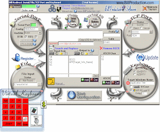
Neobaroque user interface

What do you think. Brilliant steampunk parody? Or simply the funniest, most godawful, user interface design in the history of the planet?

I can’t stop laughing! I keep expecting the Onceler to pop out and put a thneed on it!

It’s just like the early 90s software I remember when people had to make a GUI for everything, no matter if it was suited for it or not.

Lost my mind in PHP

The last few days I went a little nuts thinking about PHP and rewriting a very horrible messy script. I’d write something, make it work, write a little more, break the first bit, go back to look at the first bit and find that I couldn’t understand my own code that I’d written the day before. I ended up throwing it out completely, waking up the next morning and writing the entire thing in a nice, neat, correct way. Within a day and a half, it worked, and is readable. The most important things that improved this sad blob of pointy-looking things and regular expressions were:

– decent formatting, without slacking off! Equal sign in vim, you’re my pal.

– abstract things out into functions. Do it twice? think about making it a function.

– But don’t always, if it’s going to make a simple thing confusing. Keep it clear!

– Name the functions logically.

– Really think about naming variables so that the code makes sense when you read it.

I struggled with understanding what the hell I was doing in the first script because, I swear, everything was named $tag and $another_tag and $taglist and $tagfeed[] and $tag->tag until I was lost in a maze of taggy little passages, all alike. How very, very embarrassing! If you ever see that code, please burn it!

Now all the variables have very logical names so that everything makes sense. Doing that made me understand what I was actually trying to do — much better than I had understood it before. Everything became clear and fell into place.

The php.net pages are truly awesome. I did struggle for silly amounts of time trying to figure out what the hell to do with strings. Like do I want egrep, preg_match, substr, strstr, or WHAT? (I usually end up with preg_match since I know perl regular expressions reasonably well.) But I appreciated php.net/function pages very much. The explanations make sense, there are examples, the lists of related functions often lead me to stuff I want to know, and the comments by other users *completely rock*.

Meanwhile, I read PHP Sucks, But It Doesn’t Matter on codinghorror.com, and the entire crazy comment thread that is half computer science “real programmer” snobs, half even realer programmers rolling their eyes, and half people who know they are the 3rd half and who are Microsoft types (in other words, weird aliens from other universe). All I can say if any of these guys calls me a “script kiddie” I will enjoy kicking their teeth in!

Bike? I don’t need your bike! I can kick your ass with these here training wheels! Snobs.

My thingamajig now reads tags in from de.licio.us, parses them, decides what kind of thing they are, pulls out different kinds of posts, and builds lists of post titles by subject grouping and source in a somewhat complicated way. Then it writes all those lists out to a jillion little static files which will be cached… everything will be so much faster and more polite to the delicious servers this way. Joy!

My evil mastermind futuristic wheelchair golfcart thing

Okay, I totally want this,

so I can zoom around wearing a sort of Servalan dress, like this, in it:

Something more in black, with a ridiculous collar that looks like bat wings and that stands up about 2 feet over my head.

A futuristic space pistol would be nice too!

It’s interesting that it’s being pitched as a Segway-like device rather than as a powerchair. On the other hand, I’ve always thought about the Segway, “What the hell, 200 pounds of machinery and I can’t sit down?”

The people who call it ridiculous miss the point. They’ll get it, though, when I wheel up to them all silent and menacing and then push a button to dump them into my shark tank before my GIANT LASER comes out of the volcanic island and starts bleeping gently before it takes over the world!

It lacks lasers, and a little platform for my nanobot-enhanced telepathic cat.

There is no way I am getting in something called a “Jazzy” especially if it looks like a garage sale office chair fucked a toaster.

I cannot be contained in less than the powerchair of an evil mastermind!

Down with keyboards, down with pants!

I was thinking today about my silly invention of “smart pants” so that people could just type on their pants. Then I realized something crucial:

Who needs pants!

Seriously, to hell with pants! Down with pants!

Not to mention down with keyboards.

Instead maybe we’ll have little motion detecting rings on our fingers and will just make the barest hints of typing motions. The micro-intent to move will be sensed by the set of rings with tiny wireless transmitters. Or for the prototype, you could have the rings wire up like flexible brass knuckles to a bracelet with the transmitter.

So if I end up like this eventually, I won’t have to type 15 words a minute, and I hope also not to talk like a Dalek.

Why have typing motions at all, then? It might be important to have some kind of physical motion and body memory.

And as I contemplate this Ankle-Foot Orthosis that will soon be mine, I wonder why the thing, cool as it looks (yay for rehab equipment with style!) doesn’t have all kinds of electronic sensors in it. I don’t ask for it to move my foot around, or walk for me like a real exoskeleton would. But I WANT ITS DATA. Data, goddamn it! Think of all the cool data it could be collecting on my gait, on the strength of my hamstrings as my back toe is pushing off. Instead of whining that as the day goes on my leg gets weaker, I could just have a handy graph on my blog so that anyone who cared to know would see how well I’m walking. I noticed at BlogHer that there were exercise pedometer sorts of things that upload and track your workouts on a website and even on social sites. How about for rehab too?

I hope to see some of these mad inventions in the next few years.

Keyboard shortcuts in Thunderbird, and the failures of visual metaphors

This is so great, I’m feeling all bouncy! There is a Thunderbird extension, Nostalgy, for using keyboard shortcuts to do everything. I was just feeling super pissy that this didn’t exist, and wishing someone would write it, because I hate mousing or trackpadding: it slows me down. If I’m just using typing shortcuts, then I can get the feel of the commands in my fingers, like playing piano or Nethack, and I don’t have to think about what to do. So, now I’m super happy that it *does* exist (thanks to Oblomovka for the link). You can get the latest version here and in fact there are instructions on how to update directly from svn for the latest bug fixes.

Meanwhile, I’m really enjoying yubnub and its keystroke commands. I don’t have to do any slow mousing that requires hand-eye coordination, or extra shoulder/wrist movements that flare up old RSI problems. Instead I am training my fingers to go “apple-K wp” if I want to search Wikipedia. It becomes automatic, and I don’t have to think about it. I can do it with my eyes closed, lightning fast.

I look forward to getting back into that mode for email! I like Thunderbird, but I miss Pine because of the speed and efficiency of keyboard shortcuts.

This was something we talked about during She’s Geeky, at Beth Kanter and Elizabeth Perry‘s session on non-profits. Someone mentioned that very small technological interventions can make huge changes in a whole organization.

I found this to be true at the businesses, schools, and universities where I did tech support and training. Training classes were useful, but the best way to help a person work with their computer was to watch them work for even a few minutes, and then teach them at least one way to improve their basic workflow. A few simple tricks made people more confident and productive and happy. Those tricks would then spread throughout an organization. Sometimes, this is as simple as teaching a person that in menus, the underlined letter or the keys next to the command are keyboard shortcuts that they can learn. Or, a small trick like using tabs in a web browser can help people enormously. Many people, especially baby boomers, don’t feel comfortable with basic navigation on a computer desktop, no matter what system they’re on. The concepts that go along with productivity tricks can also help people’s understanding of what they’re doing on a computer, so they feel less like they’re flailing and instead, have constructed a mental map or geography of what’s happening.

It is amazing, but most people who use computers every day at work and at home still don’t have basic concepts down. It is like they have their eyes shut, and are trying to walk around their house by counting the number of steps to go in each direction, and they’re never sure which direction they’re pointing until they hit a wall. But most computer classes are procedural. You end up with a step by step list of what to do to produce a result, but with no understanding of what just happened.

Do you need to know those basic concepts? Or is it like driving a car — you can be a good driver, without knowing what a carburetor is? To some extent, it is more and more like driving a car. We don’t need to know anything about bits and bytes and how computers work at a low level. But we *do* need to know what wheels and brakes are. The mental model that we hold is in our physical memory. We turn the steering wheel, the wheels shift, we can picture the wheels shifting, and then the car physically turns. To be a good end user of computer applications, I think that people need to create a similar mental geography. Maps and diagrams and metaphors can really help with that.

So here is my list of things to teach people who use computers a lot, but who are flailing.

Keyboard shortcuts:

– open, close, minimize a window or tab
– open, close, minimize an application
– find, select, copy, paste
– my tabs, let me show you them
– switch between applications or windows
– search (a folder or hard drive)

Concepts:

– The difference between closing and minimizing.
– Noticing, or how to tell, if an application is already open
– You can keep many applications open at once
– Recent history, recently opened documents or apps

Geography:

– where is stuff on your hard drive
– what is a hard drive? what servers are you using? what does that mean?
– files and folders and network places; draw diagrams

Often, I’d start out trying to help someone with a complex issue, like teaching them how to do a mail merge, or fiddle around with a FoxPro or Filemaker database, and I’d end up going back to square one to teach them some of these concepts.

As I ponder this I think of a counterexample to the “mental map / diagram” idea I’m suggesting. Years ago, my otherwise pretty awesome boss at a K-12 school wanted me to create a particular thing that I loathed on instinct. Any of you who have been web developers will know what I mean! The year, 1996; the thing, a web site that was all a visual metaphor. The home page for the school web site would be a picture of a classroom-ish-office, or an office-ish-classroom, and all the things you might want to do on the website would link from pictures, like if you wanted to send email there would be a little mailbox, or to look at the cafeteria menu, click on the apple on the teacher’s desk. If you wanted to look up some document or form, click on the filing cabinet.

Number one, this would have been dog slow in the early web, on the LC-II Macs we had in most classrooms, and for people at home who only had dialup. Number two, the idea that the happy shiny pictures would not scare off the little kids who couldn’t read yet was just dumb, because one layer past the main page and you’d get to text. It is no good to click a 10-pixel-wide image of a phone book, if what you get is then… a phone book! Which if you’re 5, you probably can’t read and don’t want to use anyway. But number three, the whole idea of this visual metaphor sucked. We have invented words, and language, for a good goddamned reason and that is because it rocks! It’s efficient and powerful. If I want to look up what an apple is, in an encyclopedia, I don’t want to be floating in cyberspace and vaguely “clicking” through a 3-D taxonomy of shapes until I narrow it down to red round-ish blobs. We have words, and indexes, and alphabetical order, and search algorithms, and the convention of hierarchical menus of things-one-can-do-on-web-sites, to help us. We have the ability to group words tightly, to cluster them, in ways that makes sense for words but not for images. I don’t want to have to click on visual images one by one to figure out where to find the staff directory. I can scan a page of text very quickly to find that. Even much the most basic international symbols meant to bridge across cultures and languages are not obvious, and must be learned in context!

Possibly this is a bad story to tell because the end of the story is that when they did not listen to my objections, I mulishly ignored and resisted the Classroom Visual Home Page and instead just went off and made a plain, kick-ass, really slick and clean, page that did everything they really wanted and not what was coming out of their mouths, and that fit the specifications for dialup and legacy computers. And they used it for the next eight years. Which, while I am proud of it, maybe shows a bit too much about what it is like to have me work for you. You can’t always get what you want, but you get what you need.

Better Firefox, and a free makeover

I’m still halfway with a toe in poet-y land where everything is made of words and reality is very thin. It’s like swimming around in beautiful chaos! I love getting into that state of mind.

At the same time I’m messing about with techie things and it’s been a sort of cleanup week for me, as if it’s even more important for me to establish Order in the midst of my poety chaos.

I got fed up with my 8000+ emails in my Thunderbird inbox. I switched from using Pine about a year ago. And don’t get me started on how hard it was to get me even to the Pine level. I was very conservative and grumpy about it! Dammit, mm was good enough for me in 1989 and it was good enough for me in 1999! Anyway, my Thunderbird filters stopped working, and my inbox got goddamned huge. At times it has hit 20K. Finally, I gave up. I moved everything to a totally lame “2007 Inbox” folder. Voila! I’m at 0! As new flows in, I’ll construct new filters. And if I feel especially virtuous, I’ll go bulldozing through those 8000 old-inbox messages and put them away in logical places.

Search in Thunderbird still gives me hives. It starts searching the earliest emails first, and since I imported everything since 2003, holy hell it takes a long time to find the thing I filed away somewhere last month! Chug chug chug twiddle twiddle… sigh…

Still, it’s been pretty decent so far. I’m happy with it, though still wondering if I would be better off sending everything first to Gmail and then forwarding it on. Then I’d have it all two places without having to deal with IMAP.

My sister passed me a link today to some mozilla forum discussion about a bug with Firefox, Flash, and Ajax. Yeah I had KIND OF NOTICED. Ready to throw my computer out the window over here if it hangs one more time while I’m surfing around, hanging and chugging up my CPU without rhyme or reason. The links were all to PC/Ajax bug discussions, but here I am running FF with “Activity Monitor” up, because running top in a term window just makes the cpu usage problem worse, but with Activity Monitor I can sometimes kill Firefox before my whole machine crashes and I have to hard restart.

A few poking-around searches and I got to this repository of Firefox builds including ones for Intel Macs. So far I haven’t crashed today… huzzah. What will happen? Will it delight my heart? Will it bear all the weight I pile upon its back?

I’ve been using Desktop Manager (inspired by Skud). With this I can set up many different desktops and rotate between them, which is perfect! It’s rad! It’s not totally reliable but that doesn’t matter. I miss my old techie jobs where I would have 3 machines; a Mac, a PC, and an old Sun server. It felt like having a fabulous command center to swivel about and have all different junk set up on each computer. Plus on the Sun I’d have XWindow and 4 different desktops where I did all the real work. Anyway, now I have one small laptop, plus Desktop Manager. It’s nifty. At first I was mildly annoyed that I couldn’t get “move this window to Desktop 3” to work. Then I figured out I could just minimize it, go to 3 with a keystroke, and re open those windows with Quicksilver, which is relatively painless — I can train my hands to do it, like playing the piano. Mousing and trackpads suck because you can’t get that finger memory really working.

Mmmmm, Quicksilver. It haunts me. I am only scratching the surface of its beautifulness. It makes me so happy. It’s elegant! It feels like a powerful beast waiting to be tamed and taught tricks! So far I only really use it to switch and open apps. But, if I wanted to make some more nifty productivity stuff, Quicksilver is probably where I’d start. Danny babbled a bit to me about writing Applescripts to do various things. Applescript has never appealed to me. Maybe.

Meanwhile, at work yesterday Pete showed me YubNub so I’m in command line/ keystroke heaven. Now I can command-K up to the toolbar and I’ve got a bazillion useful shortcuts predefined.

You’d think that’s enough new stuff. But I have all these nagging projects. I spent some time at 7am this morning dicking around with me and Laura‘s Mediawiki install which has had annoying blanking and nonsense-insertion vandal attacks lately. As I looked around on the net I came across an article by WikiAngela that made great sense. I agree, it is better to leave a wiki open to anonymous edits! Then I came across Bad Behavior, a blacklist/whitelist application that I could certainly use on some blogs as well. Finally I ended up reading an incredibly useful article, Blocking Spam in Mediawiki. I did a bunch of it while Laura and I knitted our brows over permissions and group problems on the server. (Note: ConfirmEdit.php has a bug which breaks when it gets urls with a trailing backslash.) Oh man! Thank you for that excellent, brief, practical guide. Even if I cracked up hysterically laughing at your Orgasmosocialism page… OMG. Somehow “destroying the patriarchal institution of marriage and monogamy” was left off this dude’s list of the utopia which eliminates all social and political barriers to “the development of intimate relationships between consenting parties”.

Then I spent most of the rest of the day actually working. No really! It’s not just that my coworkers might read this! Except for when I went out for pie and bacon and the Bad Ass Mama’s Coffee Hour! I can prove it because finally this is up on SourceForge. I need to wrassle the ginormous release notes and bug fixes into a more news-like blog post and announcement for email lists. But it is nice to have it more or less out there for consumption. Yesterday I was melting down at the thought that I was stuck. But actually it was very very almost done, and things were fine. Why always with the last minute tearing out of my hair. I wish I hadn’t spazzed about it! At least not in front of people.

I leave you with this final, snarky, juicy thought as a reward for reading all the way to the end of this post. On a wonderful mailing list that I love dearly that shall not be named there was a long serious thread about this article on a nerd auction. The Washington State University LUG is auctioning themselves off at a Nerd Auction, to sorority girls, offering to fix their computers in exchange for a makeover. I cannot wait for the video. My god. I mean I am going to buy a plane ticket and quickly join the WSULUG. A lightning-smart hot chick in a pink sweater will buy me, and I will fix her computer. I will totally impress her with Quicksilver and Yubnub. Then, the (mutual) makeover, with a lot of giggling. Hey! Why not just sleep over in the sorority house? Geek slumber party! They’ll all end up with funny colored hair and will start wearing Leatherman tools on their belts, while I’ll come out of it all dishevelled, with lipstick all over my shoulders and a kick ass pedicure. Screw you nerds I am stealin all ur wimminz…
< br />And then afterwards when all the ditzy sorority girls naturally reject the pale weedy glasses-taped-together nerd boys, I will be around the next day to comfort them…so I’d get the action from repressed, desperate nerds too. What a great setup!

“You can buy a nerd and he’ll fix your computer, help you with stats homework, or if you’re really adventurous, take you to dinner!”

My actual answer to that is unprintable and many-leveled and includes a snarling declaration of the actual meaning of Adventure.

No, seriously. The whole idea is kind of funny and yet pisses me off big time. I love the comment from this WSU mom of a geek daughter:

Do a search on world of warcraft and you will be loaded with girls who have no idea that WSU has great computer science department with a sense of bizarre humor.
Hell, if you had had a booth showing your online programs (assuming) for the stuff she does (which I don’t do…like Maya, etc.,etc., she might take an interest in her mother’s old school. Or maybe you are all Alliance and not Horde. Or are you all waiting for Halo 3. She lives on Newegg and is building her latest and greatest computer as we speak and would never ever join a sorority.

What a taunt! Hahaha!

Seriously again, the auction PR stunt plays up the very stereotypes they are trying to fight. Another comment points out,

Seriously, people, you wonder why you need this much press to get a woman to come within 10 feet of your sorry selves? This brings back every sexist or otherwise slimy incident I experienced studying engineering. . .

I have to agree, although I love ridiculous fun and can see that this LUG thought it was playing with stereotypes, not playing them up. I wish them success in that goal. And, presuming human decency from the bulk of them, I understand the lure of the spectacle and of publicity and of a joke. However, the impression I get is also that as a woman I am expected by their department’s culture to laugh and go along with degrading stereotypes of my gender.

But, I hope that the end result is that the CS department asks women why they don’t enter or stick with CS as a major, and listens to the answers, and acts on that. Or, they could go read the many studies which address exactly that question. How about this one by Ellen Spertus, Why Are There So Few Female Computer Scientists? . How about reading She’s Such a Geek, a book of fabulous essays by geeky women, in which nearly every essay explains the barriers and annoyances we face. Or this paper by Tracy Camp, The Incredible Shrinking Pipeline. There are a zillion more.

Maybe if they paint the Computer Science Dept. building pink? That might help?

I wonder what they do to encourage racial minorities to enroll… “Nerds” fix your computer, and you teach them to… what? What race and stereotype spring to your mind? Think that event would happen? No? Then why is this one okay?

Despite everything I have ever experienced and said about geek culture and gender, here is the key. I still expect geeks to be better than this. My techno utopia has got some basic feminism in it and so do a lot of other people’s.

Technorati Tags: , , , , , , ,

Social Media Consensus Workshop, Liveblogged

I fell into this by accident because it was (surprise) happening in my office — Socialtext’s nascent co-working space, which is still under construction. So this morning I met Bronwen and Jim from Social Media Consensus. Other people: Stowe Boyd, JD Lasica, Britt Bravo, Pim Techamuanvivit from Chez Pim, Tom Foremski, Vincent Lauria, Sara Olsen, Eszter Hargittai, Julia French, and others.

Our first exercise was run by Pim. We split into small groups to look at a non profit site and react to it by brainstorming a list of words, then focusing down those lists and reactions. Sites were Global Voices, Change.org, Gimp Parade.

Notes on Global Voices, discussion led by Eszter.

* Noble goal and great idea, poor design and implementation
* hasn’t quite taken off or had an impact
* low Google/Technorati rank. They’re not even registered on Technorati
* navigation and having to scroll past the giant tag cloud; confusing

My own reaction to GV is very different; I think of it as useful and it comes up all the time for me when I’m looking for blogs and news (in English) from Latin America. I also think of it as a beginning, a small but extremely important start, in facilitating representation of voices from many different countries.

Stowe adds that it has unclear goals. Manifesto makes it sound like it’s around activism. Bronwen’s perception is that they influence NGOs like Amnesty International. Sara Olsen points out that the concept of free speech is culturally biased. Stowe tells a story about people’s reactions to his tshirt that says “Stamp out free speech”.

Other keywords: free speech, discovery, not interactive or intuitive.

Julia points out that the expectation of interaction is fairly new. Stowe says we require and need conversation, interaction, that the lack of it is as bad as it gets.

Notes on change.org

I was in this group. We had a very positive impression of change.org, with keywords like belief, people, community, identity, activism, progressive. I signed up for the site as we were talking. It was very clear what it was, what it was for, and how to use it. It is activism focused but also very personal and it’s possible to differentiate many voices. (Or maybe Britt and JD and Pim and I are all the most optimistic fluffy-bunny optimists of the group today?!)

People are made of ideas, and ideas are made of people. We can move back and forth very seamlessly.

What if Global Voices could work this way? It would be scalable, expandable.

Notes on Gimp Parade

Critique of presentation and style. Based on Blogger. Enormous amount of information, difficult to navigate. Hard to access and tell what we were looking at. Bronwen explained what the site and blog and carnival are about.

What we want to see: the site representing its value, its status and value in its own community, its readers, who they are and what they think. The content is great, provocative, dynamic, emotive, genuine, authentic, has a real voice. Stylistically it’s handicapped by being bland. Notes about subcultural immersion: you can drop in from outside that subculture and learn about it. Would anyone google and land on this site? Maybe not, you might come to it from links in from others in the community. When you hit that page, as an outsider who landed there from a google search, you would have no idea what it’s about. Moving to better technology than Blogger and its About page capabilities would help. A question: is it looking bland in some ways because it’s trying to be accessible to machine readers, etc? Is it really accessible that way?

Bronwen points out that people with disabilities are hugely more likely to blog than other categories of people. Re-forming identity online. (So true, and for me, disability drove me very hard into online identity, in the early 90s and then later when I was increasingly mobility-impaired, using a wheelchair and limited by pain and exhaustion.) Bronwen also brings up some disabled bloggers who left online communities because of the pressure of being tokenized and put in a position of always “representing” and losing their ability to have personal conversations.

Notes on Netsquared, led by Sam Perry

Positive aspects:
Negative: What is it? What are they doing? Not clear enough. We came up with verbs. Verbose. Confusing. Made our minds close. Remixing – two columns confusing. The sponsor validation is good but didn’t link in to the rest of it. Where are they leading us to? Uninviting. Stopped us. Impasse. Hidden.

Rounded corners, we love rounded corners. Mission statement too fuzzy. We know what they’re trying to do, but the site doesn’t say that! Trying to do something social, but not getting there. We’re professing to be social and have a social nature, but the tools aren’t there. Stuck. If you know someone who’s tied into it, you get it, but if not, you won’t get it. The sitemap is good. Julia mentions being authentic and authenticity, and that’s not happening here. It’s hard to add yourself. The site is pretty though. Stowe adds that the DNS is misconfigured. You can’t comment or add yourself or interact with it at all without registering. We want more visual, more people, more photos and video.

****

What I’m noticing here is that the sites we’re talking about, other than change.org, are not social networks, and we want them to be. We all in this room seem to believe that social networks are inviting, welcoming, intuitive, and powerful.

***
After lunch: I missed some of the discussion, and had to be in and out of the meeting unfortunately, but these words were recorded on sticky notes:
usability, aesthetic, design, entertainment, accessibility, political, change, ego-feeding, constructive, progressive, community, global, international, action, people, beliefs, interactive, discovery, people (again) informative, activism, empowering, impact, identity, discovery, ideas, sustainability, sustainable business model. Combining all this up: impact — joining people, campagning against/for, affecting change, bringing attention to something, activation point rather than tipping point, engagement—- policy critical/cognitive, analytic, social impact. The point of these lists of words and the discussion around them is to figure out what things need to be measurable and measured for SMC’s indexes.

Eszter points out there’s decades of research into points of social change. Polls and getting background information on people, which is tricky to do when you have aggregate data on the web, there isn’t standard data form for social scientists. This is crucial for measuring social issues and representing everyone, not just elite groups. (***fangirls Eszter***) (***invites Eszter to come speak for Wiki Wednesday***)

Technorati Tags: , , ,

SXSWi notes: High Class, Low Class Web Design

Notes on High Class and Low Class Web Design.

Respecting your audience. Do you treat them as equals? Culturally, educationally? What if they’re not your peer group? People who call their audience “marks”. Fans officially, but the treatment in the industry is “marks”.

This is the 2nd panel that has used this carny terminology. Evan Prodromou was also critiquing the mindset that treats an audience as marks or suckers.

The room is very large and crowded, so I can’t tell who is speaking. Someone’s talking again about being too class conscious and how that leads to a lack of respect.

Methods of making design decisions. Measuring sales with varying design in publishing and in web design and with usability studies. Liz Danzico is talking about usability, class, and layout.

Web sites and products targeted at “lower classes” use statistical methods of determining good and bad design, while stuff for “upper classes” rely on personal expertise for design. That maps to other high end products like fashion and luxury goods. For high end they’re designed and they see what happens, while for “lower” they are the product of testing. Steve Jobs mentioned…

(I think that it’s pretty funny that this panel purports to be respectful, but they’re using terminology like “high” and “low” which I find inherently disrespectful. And I would talk about “working class” not low class or “unwashed masses”. Jeez!!!)

Khoi Vinh talks about the NY Times and their testing process. He disagrees, I think, that the NYT is high class, but also says that if you think it is “high class”, he would like people to know that they do do testing and usability studies.

Appropriate design and aspiration. If you are designing for an audience that is different than you, do you aim for uplifting their sensibilities? Or do you design based on what you know they already like? A question for designers in the audience to consider.

Liz Danzico talks about how to tell how much is too much. When you’ve gone over someone’s comfort level. The toothpaste ad with toothpaste smeared on the guy’s chest. (Audience laughter)

Brant talks about his experience at WWE. Expanding the design for a wider audience who would not be embarrassed to pick the magazine up. Men in their 20s.

Starsky and Hutch, Dukes of Hazzard, int he past. Now we have Sorpranos, Lost. Complicated shows. People stopped looking down on their audience. TV is better than it was 20 years ago. Quote from Paul Rand. The Language of design. The public is more familiar with bad design than good design. It is, in effect, conditioned to perefer bad design… The new becomes threatening, the old reassuring.” You’re exposed to a certain design style your whole life. Is this design taste related to class, what you learn ? Or is there an inherent goodness or badness that transcends?

This question relates well to a book I’ve been thinking about all year, A Framework for Understanding Poverty. It explains a lot of class conversations and expectations in relation to class. Working class geographies of understanding the world are based on people and trust of people. Middle class geographies of importance are rooted in stuff, in brands and quality of stuff. Upper class geographies prioritize aesthetics and discernment. Aesthetics is a tool often used to establish and maintain class boundaries.

***
Wow, Peter from Adaptive Path just made that very point about aesthetics and class mobility. Aesthetics is used to prevent that class mobility! I was just thinking about Widmerpool’s overcoat from Dance to the Music of Time; he gets it subtly wrong and the upper class characters know it and shun him; he can’t ever really pass. IMHO, in the U.S. this is also used to maintain race and gender boundaries that connect to class status.

Technorati Tags: ,

SXSWi: Kathy Sierra's opening remarks

Kathy Sierra‘s opening remarks has two or three overflow rooms full of people. We’re responding to the screen just as if Kathy were in the room – what a great speaker!

Humanizing software and the net.

Audience participation exercise:

If you had to either save a guy from drowning or photograph it, how would you tag it in Flickr? Stand up, this makes you a “designer” (or i would say a content person)

If you had to code open source software or have sex… Ruby or Python? Stand up.

If you haven’t stood up, look around you at the people who have a job!

Now talk to a person who isn’t your same kind.

1) help users get together offline. face to face still matters.
2) make software interactions feel more human
– What can the user do with a human but not a computer?
– body language, gestures, (photo of face expressing “Whaaaaaa!?” or WTF: knit brow, questioning, maybe a little bit pissed off, puzzlement)
– Look confused, ask a question. You can’t do that with your software. Does your software know anything about that face?
– photos of anxiety, bewilderment, head in hands. Other entity responds to “looking confused”

A neurological quiz. Various “I-statements”. Aspies unite! In the tech world we are actually proud of our Aspergers. All our applications have Aspergers. (Also, all cats have Aspergers.) How can we compensate? Our app must know that a person is confused.

Nobody is passionate when they feel like they suck. Passion threshhold, Suck threshold. Your apps make people feel like they suck instead of getting them up past the suck threshold. I no longer suck, but I’m not good or expert anymore. We have to get people past that threshold. The passion threshold is when they’re so good they feel confident and expert. Passion isn’t about a tool, it’s about people feeling good about their ability.

Add a WTF button.

A great point: the help file or faq thinks you look like (photo of smiling confident student-looking guy with pencil poised to take notes) but really you’re like (photo of guy looking frustrated and flipping off his computer).

Example of a user in Excel. “I used to use Excel a long time ago and I just want to add up the numbers in a column” The help is utterly unhelpful and her screen captures are hilarious. People actually want to say “I’m lost. I’m stuck. I don’t know how I got here. I want to do a thing, but I don’t know what it’s called.”

Goal of the WTF button: Get user to the right context asap. Then give him an understandable set of questions. Let the user choose a high level statement. “I’m lost.” Narrow the context.
What other emotions can a computer recognize? buttons with faces. Click on picture of what you’re feeling. Bastards! Terror! WTF! Happy! You suck. He’s not really feeling “you suck”, he’s feeling, “I suck”. Hating software you’re hating it for making you feel like an idiot. If you can’t fix your application you can still help by reorganizing your documentation.

Looking confused tells a human, a human teacher for example, to try telling you a different way. Software gives you one chance, it’s like saying “I’m only going to tell you this once.” You’ll know you’ve succeeded when they feel creeped out.

Conversational language. Talk like a human. Use the word “you”. Contractions. Your brain reading conversational language – pays more attention.

The positive impact of good user experiences. If make a user have a slightly better experience, you’ve done something good. You give a person an opportunity to be in the “flow” state.

(YEAH!!!)

Those are some of the happiest moments in a person’s life. That’s the kind of experience we’re giving people all the time.

Technorati Tags: ,