Visit to the SF Lighthouse
As part of the CripTech symposium I went along on a tour of the Lighthouse for the Blind and Visually Impaired a couple of weeks ago. Chris Downey, an architect who is on their Board of Directors, kindly gave us the tour and the benefit of his insight into the architectural design of the space.
The lobby was designed to feel welcoming to people who might be coming to the Lighthouse for the first time, or really for anyone. It’s a spacious central space in the complex, connecting through a large, open, glass walled stairwell to the floors above and below. It’s possible to hear people talking or laughing from other areas so you are aware of social activity nearby in the space. I was really impressed with the auditory environment, as I really could feel the warmth of “other people are here” without it being distracting or echoing in any way. The walls were lined in some kind of sound baffle type of felt (I think) with a design of wooden slats overlaid that affect the acoustics of the space and are also quite beautiful.
After being there all morning, the street and then the food court we had lunch in were noticeably inhospitable in their acoustics. I realized I felt more relaxed and able to focus while we were on the tour of the building.
There is plenty of natural light, and also bright but not overwhelming overhead lights in long strips going north to south for extra orientation cues for partially sighted people. There were also interesting “light walls” with big glowing panels, and sliding controls which anyone can adjust to play with the color of the light.
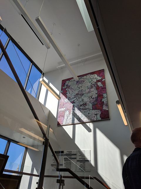
The flooring is set up so that there are navigable edges for shorelining through the hallways. Travel paths are polished concrete, and seating or other areas are carpeted with metal edges to give more information to cane users about navigating the space. The stairs have distinctive kinds of wood (I think different at the landings so that there is a different sound from a cane tap) and bright but not overly reflective metal edges for high contrast (again, good for people with partial vision).
One especially beautiful touch – the handrails around the stairwell were the softest, silkiest wood with an unusual and nice-feeling shape, slightly concave on the side facing the travel path, and then curved in a slightly irregular way – not a half-circle or half-oval but a more organic feeling shape to fit a hand. If you visit, don’t miss feeling the handrails.
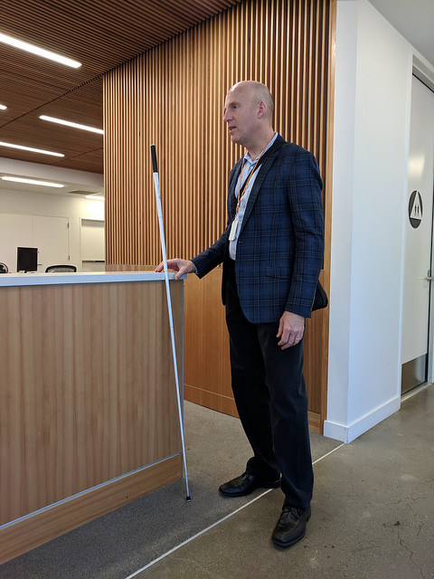
Here’s a picture of Chris demonstrating another thoughtful and elegant touch: the reception area countertops have subtle niches in the edge of the counter to allow a white cane to rest there without slipping to the floor. The photo also shows the wooden acoustic slats that line the wall and the thin metal boundary between concrete travel pathway and carpeted reception area.
We saw the event rooms, training kitchen, science lab which I think is for making things and doing electronics or computer workshops, and a little maker space with large braille embossing printers and 3-D printers. The art all around the space was really neat, a lot of it from the collection of Donald Sirkin, the guy who left over 100 million dollars to the Lighthouse in his will. There was also a memorial wall talking about Sirkin and his life. (On my to-do list: write a Wikipedia page for Sirkin.)
As a wheelchair user I also noticed the spacious design, since there were several wheelchair users along on the tour we would get into a few narrow hallways, but each time that happened and there was a sort of bottleneck, I was able to go around the circumference of that section of the building and circle back to the “front” of the tour. There were points at each end and at the middle of the building on each floor where the hallways opened up to wider spaces so there were opportunities to regroup and the space didn’t feel claustrophobic. I appreciate not feeling trapped and being able to move freely around a space!
A few years ago I wrote a short text adventure for an unconference space, along with obtaining a tactile map of the interior of the building. It was a simple hack job to give the layout of the rooms. I started thinking through ways to make a much better one for the Lighthouse. So, a textual game where you can walk through a space and develop a feel for its geography and layout. To be done well, this should integrate a holistic impression of the different spaces and how they can be traversed or explored, rather than some straight “visual description” information it would need to include the ways that a space can be experienced by someone blind or with partial vision.
Playing with similar ideas a bit in Inform7, in writing “room” descriptions from the point of view of a wheelchair user, which for me, includes not just an awareness of slopes but of the feel of surfaces and whether they are pleasant (marble is amazing) or jarring (literally). One or two words can indicate that “you” the reader are wheeled. I think that can have an interesting effect on game play. For the Lighthouse, I might try just describing the lobby and a couple of connected rooms as an experiment. Since I am not blind or vision impaired I would need to pair up with someone or do lots of interviewing folks to do this project well if I did it for real! My 4-room experiment of being in a sort of fantasy world game setting, on wheels, gave me a little shiver of recognition to play through, even though I had just written it myself and it was not a surprise be in a garden and then to see the words “You roll into the gazebo.” Yet it was still a surprise, a pleasantly non-alienating one. Is there a word for de-alienating in a healing way, that makes you realize the ways you are alienated (from yourself or from participation or acknowledgement) in default representations? It made me think that representing “you” the player of interactive fiction as disabled along different axes (as living and experiencing reality in particular ways) could be a really powerful game.
Thanks again to Chris and to the Lighthouse and to Karen Nakamura who invited me to CripTech! I particularly enjoyed the tour and am still thinking hard about aesthetics and universal design & how our concept of whose experiences are important affect design & engineering decisions. A beautiful example of technology in action to make a pleasant and functional environment. If we do get a San Francisco Disability Cultural Center someday, I hope it will take the example of the Lighthouse and follow their lead!
